Input columns
Overview
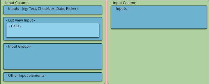
Throughout InsuranceSuite applications, users enter data into cells or inputs. All inputs must appear within an input column container as shown in the following diagram.
For inputs, data is entered into InsuranceSuite when:
- Users manually enter data into input columns.
- An input set reference pulls existing data into the current space. For example, while adding coverage to an existing policy an input set reference could be used to automatically include data already in the system.
Usage
Input columns
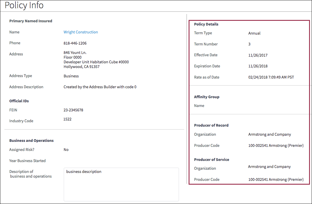
Input columns appear within detail views and include labels and values. Some Input columns are view-only while others can be edited.
Use view-only input columns to place elements on a grid. A grid contributes to consistency and facilitates scanning.
Use editable input columns when users need to edit or manually enter information.
Input headers and input footers are input columns that span the width of a detail view:
- Each detail view can only include one header and one footer.
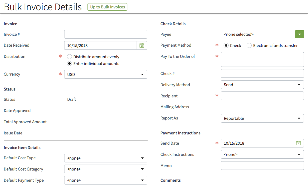
- While headers and footers can be used without other input columns, the most common usage is to place headers and footers above and below existing input columns. The following screen shot shows an example of a footer below two input columns.
Input Sets and Input Set Refs
Input set PCF files are collections of inputs that allow developers to use the same content in a variety of places. An input set defines column contents and can be placed into a detail view or an input column.
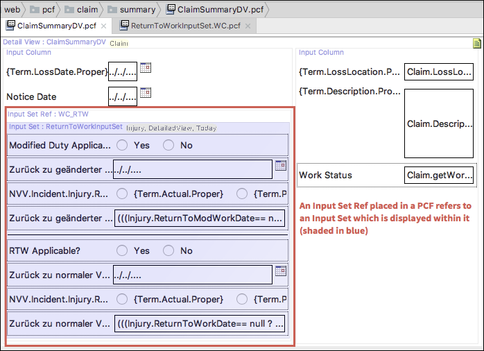
Input set refs instruct the system to mirror a specific input set such as the ReturnToWorkInputSet highlighted in the following screen shot.
List View Inputs
List view inputs allow tables (list views) to be placed into a detail view panel. List view inputs must be placed into an input column.
See usage for list view inputs and best practices for list view inputs for more information.
PCF elements
Primary function
- Input Column
- Input Divider
- Input Set
- Input Set Ref
Secondary function
No elements use this widget as a secondary function.
Best Practices
Follow the best practices for buttons, check boxes, date pickers, detail views, drop-down lists, section labels, links, radio buttons, and text boxes.
Columns
- When placing two input columns side-by-side, consider applying a maximum width of 480 pixels for each to ensure optimal layout on screens with a 1280-pixel resolution.
- Note: While most input columns adhere to this width guideline, there are instances where they do not. The reason is that InsuranceSuite has evolved over a number of years. As part of Guidewire's effort to achieve excellence on all fronts, we are working to modify the InsuranceSuite UIs to comply with industry best practices for design.
- Limit the number of columns to avoid horizontal scrolling.
- Use vertical dividers (lines) to group separate input columns.
- Use white space and horizontal dividers to make content easier to scan and absorb.
Field Labels
- Information in input columns is displayed in label-value pairs. The field
label is usually on the left and the value on the right.
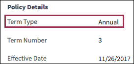
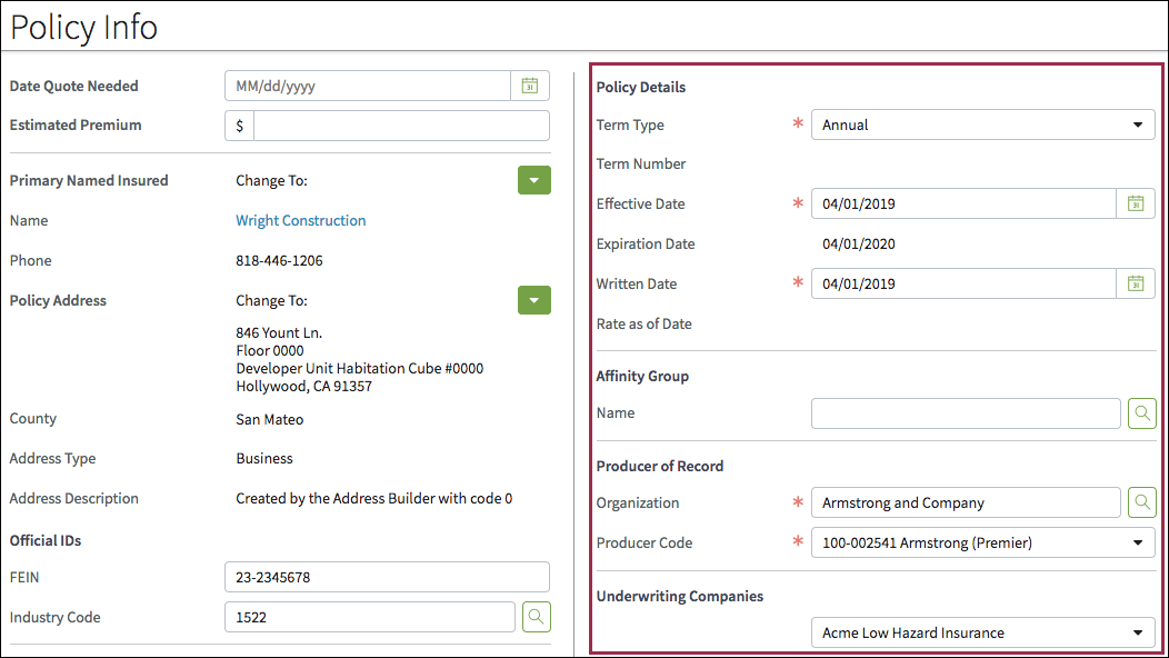
- In cases where the value is quite long, place the value to the left and the
field label above the value as shown in the following screen shot.
Alignment
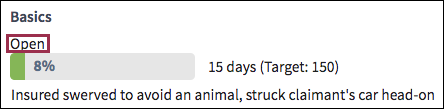
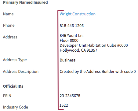
- By default, values (data) are left-aligned. Keep data left-aligned for
standard contact information and identification information as shown in the
following screen shot.
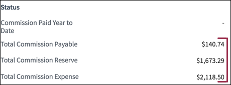
- Right-align currency, as in the following screen shot.
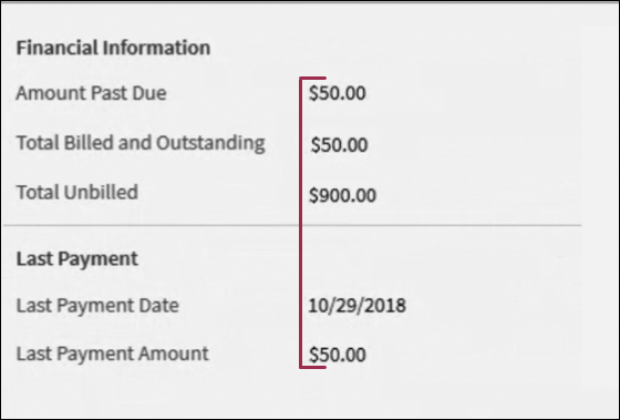
- When currency appears with other data types, left-align all data as shown in
the following screen shot.
- Note: While most input columns adhere to these alignment standards, there are instances where they do not. The reason is that InsuranceSuite has evolved over a number of years. As part of Guidewire's effort to achieve excellence on all fronts, we are working to modify the InsuranceSuite UIs to comply with industry best practices for design.
Prefixes and Suffixes
Use a white background for prefix and suffixes. Do not use a transparent background.