Toolbars
Usage
A toolbar is a row of data action buttons and input widgets.
Use toolbars to:
- Provide easy access to common tasks within BillingCenter, ClaimCenter, or
PolicyCenter.
- Apply an action to multiple objects within a table (list view).

- Guide users through a wizard.
PCF elements
Primary function
- Toolbar
-
- Toolbar
- Toolbar Divider
- Toolbar Buttons
-
- Add Button
- Checked Values Toolbar Button
- Edit Buttons
- Iterator Buttons
- Picker Toolbar Button
- Remove Button
- Toolbar Button
- Toolbar Button Set
- Toolbar Button Set Ref
- Tree Buttons
- Wizard Button
- Toolbar Inputs
-
- Toolbar Filter
- Toolbar Input
- Toolbar Range
Secondary function
No elements use this widget as a secondary function.
Best Practices
Context
If a toolbar is placed directly on the screen, and allowTitlePlacement is
set to
true (the default), then the toolbar will be pulled up
into the page title bar.Make it clear what the toolbar affects.
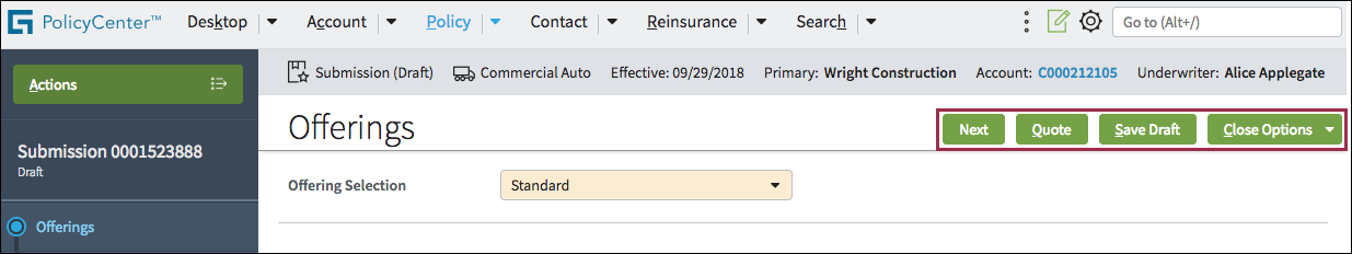
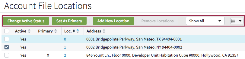
- This toolbar applies to the entire page.
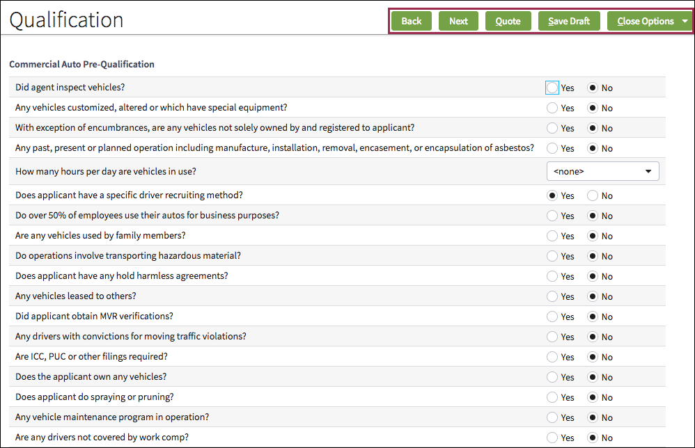
- This toolbar applies to a specific section.
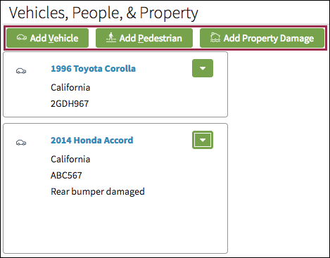
- This toolbar applies only to the table.
Grouping
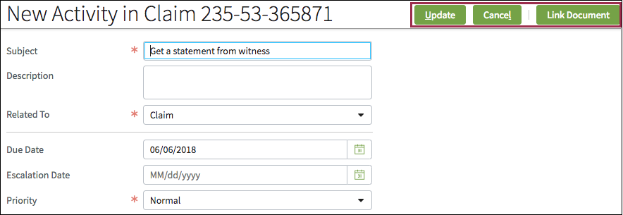
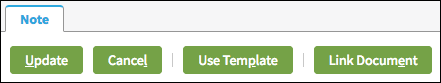
Use dividers to separate buttons and other widgets into distinct groups. In the following screen shot, the dividers group Update and Cancel and separate the Use Template and Link Document buttons.
Sequence
For toolbars with multiple buttons, place the most frequently used buttons to the left. For example, place Update before Cancel.
Purpose
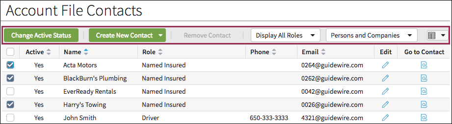
Clearly convey the purpose of each toolbar element with a descriptive label such as Change Active Status or Create New Contact.