Tabs
Usage
Tabs divide information into distinct sections within a single page.
Use tabs when:
- Space is limited.
-
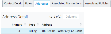
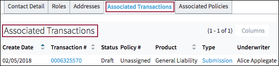
There is a need to divide content into different sections such as Addresses and Associated Policies.
- The content of each card can be viewed separately and is not reliant on the content in a different card.
- When there are two to seven sections, and section names are relatively short.
PCF elements
Primary function
- Card
- Card Iterator
- Card Panel
Secondary function
- Panel Ref
- List Detail Panel
Best Practices
- Present tabs as a single row above the relevant content.
- Avoid nesting (tabs within tabs) to ensure that unselected cards are always visible.
-
Whenever possible, avoid placing required fields on any tab other than the first or default card. This practice is very important. Placing required fields out of the user's view will likely result in more errors.
- Ensure that the content on each tab stands alone. If users take an action on one
tab, it should not change or affect the content on another tab.Note: There is one exception. In certain cases, clicking a control on one one tab will display a previously invisible tab. See dependent controls for best practices for triggering the display of additional information.
-
Set a default based on usage metrics.
- Use clear labels that accurately describe the tab's content.
- Use title case for all labels.

- Match card labels and the titles on corresponding pages. See page title best practices.
- If there is only one tab, use the PCF property to hide the tab.