Buttons
Usage
Use buttons when users need to initiate an action.
Buttons shown in a table (list view) or an input column can be constructed:
- As a button input:
- As a link that renders as a button. This implementation allows:
- One or more buttons to be placed in a horizontal line within an input
column.
- The option for a link to render as a mini-button that is smaller than a
standard, primary button. Use mini-buttons in tables to conserve space
and provide visual balance within a table.
Note: In most cases, the preferred usage is links that render as mini-buttons. Studio does, however, allow links to be rendered as big buttons.
- One or more buttons to be placed in a horizontal line within an input
column.
Buttons and toolbars
- Editing information in an input column.
.png)
- Selecting an item in a table
in order to choose the information to display on a subsequent
page.
Use toolbars when users need a group of buttons to perform a certain task, such as proceeding through a wizard.

Buttons with icons
Add icons to a button to reinforce the button's purpose.

PCF elements
Primary function
- Add Button
- Button
- Checked Values Toolbar Button
- Edit Buttons
- Iterator Buttons
- Picker Toolbar Button
- Remove Button
- Toolbar Button
- Tree Buttons
- Wizard Buttons
Secondary function
- Toolbar
- Toolbar Button Set
Best Practices
Sequence
- Back to the left of Next
- Cancel before Back and Next

Grouping
Place buttons with functions in the same category next to each other. For example, Assign, Skip, and Complete should be grouped together. Use dividers to demarcate distinct groups of buttons, especially when there are many buttons in a row.

Note: The framework will automatically hide toolbar dividers if there are no buttons.
Grayed out
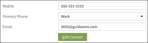
Show buttons but keep them in disabled state until the user selects the option that enables the button or buttons. See Disabled controls for details about when and how to display grayed out buttons and other controls.Button text
- Use verbs whenever possible and use specific terms such as Assign or Complete.
- Use title case (capitalize first, last, and all important words) for button text.
- In most cases, use:
- Links for navigation within a page or between pages.
- Buttons to take an action such as filing a claim or confirming a change.
- Links when the required action is embedded directly into a sentence.
Avoid using an ellipsis ("...") in button text.
Use short, precise words or phrases by using the name for the object type the button will create. For example:
- New User
- New Claim
Use the following terminology to clearly distinguish new from add:
-
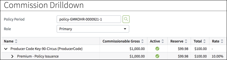
New for a new object. For example, for submitting a new quote in
PolicyCenter use a button that includes the word New as shown in the
following screen shot.

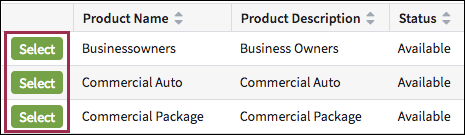
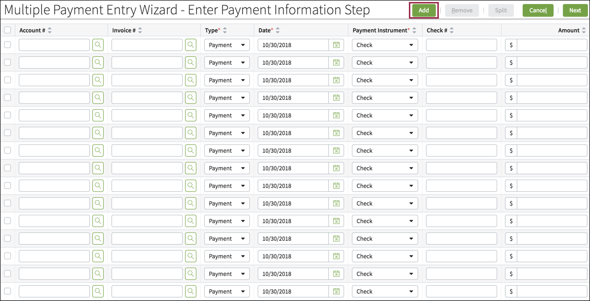
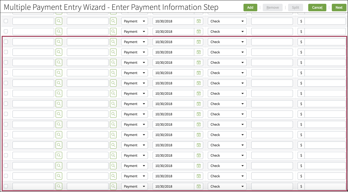
- Add when appending an item to an existing list. For example:
- If an existing list has three vehicles but should have four, provide an Add button to allow users to include the fourth vehicle in the list.
- The Add button in BillingCenter appends 15 rows to an
existing table.
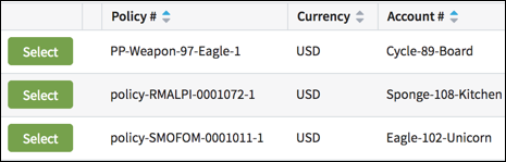
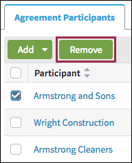
Use the following terminology to clearly distinguish delete from remove.
- Delete when the object will cease to exist.
- Remove when the operation will take an item out of the list without
deleting the larger list. As shown in the following screen shot, for
example, the Agreement Participants list includes three items.
Armstrong and Sons has been included by mistake. The
Remove button omits Armstrong and Sons but retains the
list.
Buttons with Icons and Button Text
- Use the same color for icons and text on buttons. Please use the provided color theme system.
- Button icons should reflect the style used for other icons throughout InsuranceSuite. See Designing new icons for more information about designing icons for InsuranceSuite.

Icon-only Buttons
Always include a tooltip for an icon-only button in case the meaning isn't completely understood from the icon.
