Designing new icons
Adding an Icon
Follow these steps to add a new icon to use in InsuranceSuite:
- Design the icon for simple and effective user interaction, using metaphors that are easy to understand. See Design Principles below.
- Build the icon as per the iconography system described below, to ensure accurate
weight relative to size. The icons are essentially vector graphics that can be
resized easily without compromising their appearance. A vector-illustration tool
should be used, such as Adobe IllustratorTM.
In fact, Guidewire provides Adobe Illustrator templates to assist in the design effort. This template and instructions are available on the Guidewire Community site.
- Export to an SVG File. Then:
- Remove width/height data.
- Remove classes.
- Remove HEX values.
- Remove all Adobe Illustrator-specific data such as the title.
- Deliver the SVG file to the Web team.
Design Principles
Semantics
Icon semantics define a set of visual elements that indicate functions, objects, and states for iconographic communication. Follow the techniques below to find the right visual semantic:
- Derive inspiration from the real world. An icon should be easily recognized by a user.
- Use context to reinforce an icon's meaning. Context is critical because a semantic element can have different meanings for the user depending on where it appears within the UI.
- Create clear, simple, and recognizable shapes. For accessibility reasons, visual elements should be drawn as clear shapes and should not rely solely upon colors or other means in order to be recognized.
The Geometric Icon Grid System
A geometric grid serves as the foundation for Guidewire icons. Designers ensure consistency, stability, and visual balance by leveraging this grid to:
- Optically center asymmetrical shapes.
- Align icons on whole pixels.
- Center a vertical or horizontal stroke.
- Ensure that icons do not exceed 16 pixels in width or height.
- Center shapes within a bounding box.
- Place circle grids outside the bounding box if necessary for optical balance.
Building Blocks
Guidewire iconography is based on a proportional, 16-pixel grid system that provides a centralized set of components for design construction. Adhere to the following proportions unless these proportions disrupt the optical balance:
- 1:1 = 16px (base)
- 2:1 = 8px
- 4:1 = 4px
- 8:1 = 2px
For stroke, use square caps (required) and a 1-pixel weight.
For diagonals, use 30°, 45 °, and 60°.
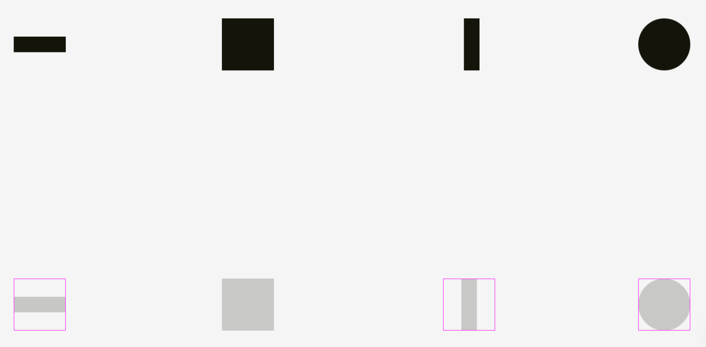
Optical Balance
Icons are generally square, with the size of the square representing the "bounding box." In order to maintain visual weight balance, the amount of black versus white in any bounding box should be as consistent as possible from with existing Guidewire icons. Icons with more negative space fill more of the square corner-to-corner, and those with a lot of black pixels sit in a smaller subset of the bounding box surrounded by padding.
To be balanced visually with squares, icons of other shapes should be wider and higher so that their areas are similar.
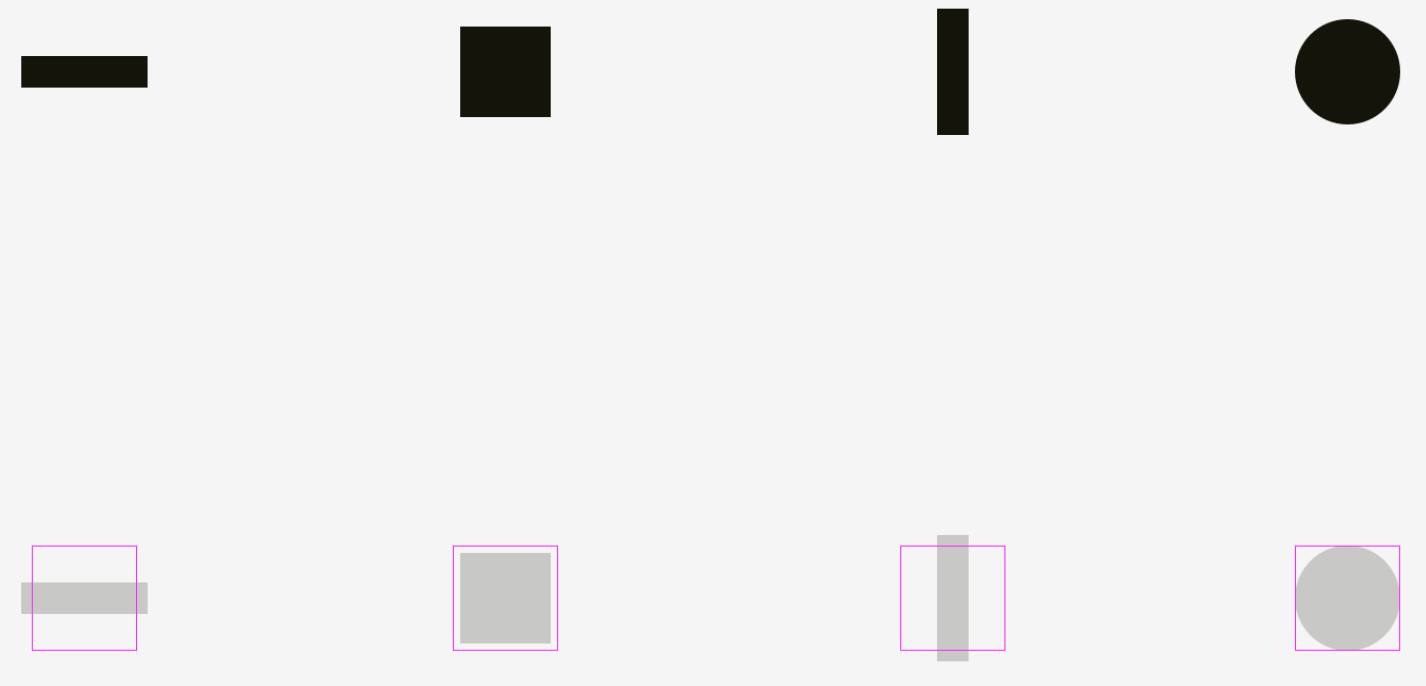
It is important to make all icons well-balanced so that no icon stands out too much or looks too tiny.
If we directly inscribe icons into square areas, the more square-like icons will look larger.
We need to compensate for the weight of differently shaped icons by allowing visually smaller icons to hang beyond the icon area and by leaving some space between visually heavier icons and the icon area.
- Important to remember
-
- Optical weight is how human eyes perceive the size and significance of an object, and it doesn’t necessarily equal its pixel size.
- Circles, diamonds, triangles, and other non-square shapes need to be larger in order to be optically balanced with squarish shapes.
- Areas for icons should have some space reserved for optical balancing. It’s crucial for sets of icons, which should look consistently.