Tooltips
Usage
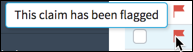
Tooltips are messages that appear when a cursor is positioned over an icon, image, hyperlink, or other element. In InsuranceSuite, users access tooltips by hovering over an item such as the escalation icon shown below.
Include tooltips when:
- Users need additional information located near the interaction they are about to perform.
- The interaction might not be intuitive.
Do not use tooltips when the meaning is obvious. For example, a button with a clear label such as Next does not require a tooltip.
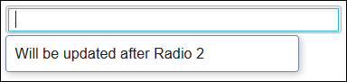
Help text refers to messages that appear beneath inputs and cells in edit mode.
Use help text when users need guidance about what to enter in an input or cell.
PCF elements
Tooltips do not exist as the primary function for any widget. They are properties of widgets such as icons.
Best Practices
- When tooltips and help text are necessary, use them consistently. For example,
including tooltips for all stand-alone icons will allow users to quickly obtain
brief and context-specific information.
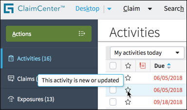
- Use clear, concise wording such as This activity is new or updated.
- Do not use a tooltip that simply repeats what users already see in the UI. Provide detail such as the status of an activity or payment.