Text boxes
Usage
Text boxes validate input, allow users to enter or modify text, and help users fix errors. Use:
- Single-line text boxes when it is not possible to offer a predefined set of
options as with names, cities, or ZIP codes.

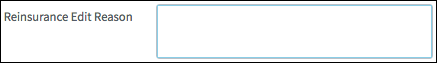
- Multiline text boxes when users will likely need space for two or more lines of
text.
PCF elements
Primary function
- Text
- Text Area
Secondary function
No elements use this widget as a secondary function.
Best Practices
Layout and Labels
For all text boxes:
- Generally, stack multiple text boxes vertically.
- Left-align labels.
- Place labels near the text box to ensure that each label is clearly associated with the correct text box.
- Use a specific, clearly-worded label.
- Wrap long labels. Do not use an ellipsis.
- For labels, avoid sentences whenever possible. A phrase keeps the label short and avoids inconsistencies between sentence and title case. For example, use Loss Location instead of Where did the loss occur?
- Unless the label is a complete sentence, use title case (capitalize
first, last, and all important words).
For text boxes in edit mode:
- Use the same height for single-line text boxes.
- If more vertical space is required, use a multi-line text box.
- Whenever possible assign the same width to text boxes in close proximity. This uniformity facilitates scanning.
In read-only mode:
- Whenever possible assign the same width to text boxes in close proximity. This uniformity facilitates scanning.
- To accommodate long text, expand the height and wrap text as needed. Do not use a scroll bar in a text box.
Input and Error Reduction
Make input easier and reduce the chance for errors with:
- Autofill: Users click inside the text box to select an item to automatically populate the text box.
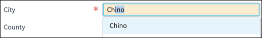
- Autocomplete: This widget assists data entry by typing ahead the first
matching entry in the relevant database. The drop-down then offers other
matching entries allowing users to select the best option.Note: While autocomplete often helps users, it is not without risk. Do not use autocomplete if users are unlikely to know which terms to type. For example, while the term "car" is not hard to understand, it has commonly used synonyms such as "auto" and "vehicle." In such cases, users might become frustrated if they type the first few letters for a term that will not display auto-complete options.
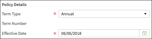
- Reasonable default values such as Annual for the term and the current
date for the Effective Date. To the extent possible, populate text
boxes with the most likely values. Providing good defaults minimizes
decision making and expedites data entry.
- Placeholder text.

- Pickers.

- Field validation, and by informing users if they have entered an invalid value such as letters when digits are the only valid values.