Tables
Usage
Tables
Tables (list views) make it easier to scan, read, and compare data. Tables and tree tables are distinct. Please see Tree tables to learn how they differ from tables.
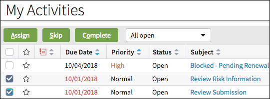
Use tables to display important tabular data such as activities.
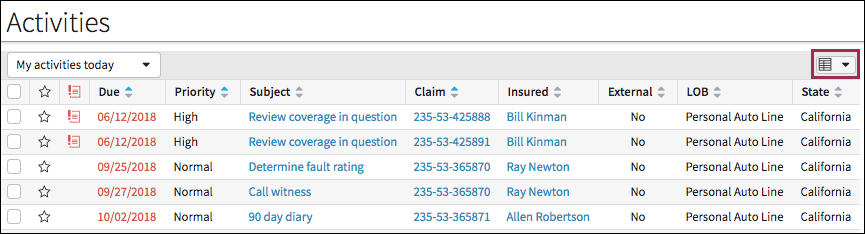
Many tables include a columns button. This button gives users the option to group rows by field and/or hide certain columns from view.
- Header Rows
- Header rows include column headings and a sorting feature.
- Static Rows and Iterators
-
Static rows can function as:
- Footers.
- Summary rows displaying a calculation.
- A row within a table that is not an iterator.
Iterators draw data from an array or a data set. Iterators can display one or many rows.
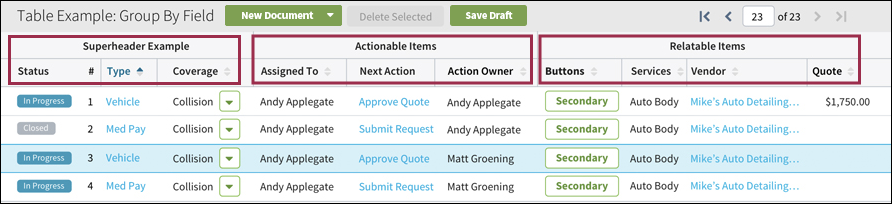
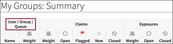
- Smart Headers
- Tables in InsuranceSuite 10 also include a smart header feature. Use
smart headers when you need the ability to include multiple levels of
headers. In the following screen shot, column headers are grouped under
another header.
List view inputs
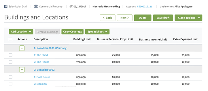
List view inputs allow tables (list views) to be placed into a detail view panel. List view inputs must be placed in an input column.
Use list view inputs to display tabular data within a detail view as shown in the following screen shot.
PCF elements
Primary function
- List View
- List View Input
Secondary function
List Detail Panel
Best Practices
Tables in dashboards
Tables (ListViews) in dashboards are governed by different rules. See Tables (List View Tiles) in Dashboards for details.Table Length and Pagination
While the current default length for tables is 15 rows, assign a page size best suited to the specific context and use case. Research indicates that users prefer to scroll versus page because it is easier to scan or search for information on a single page.
Use pagination for long tables when:
- Loading the entire table at once will hinder performance. In such cases, set the number of rows to the largest reasonable number.
- A page includes two or more tables or tables and DetailViews. In these cases, a long table without pagination would push other content down the page.
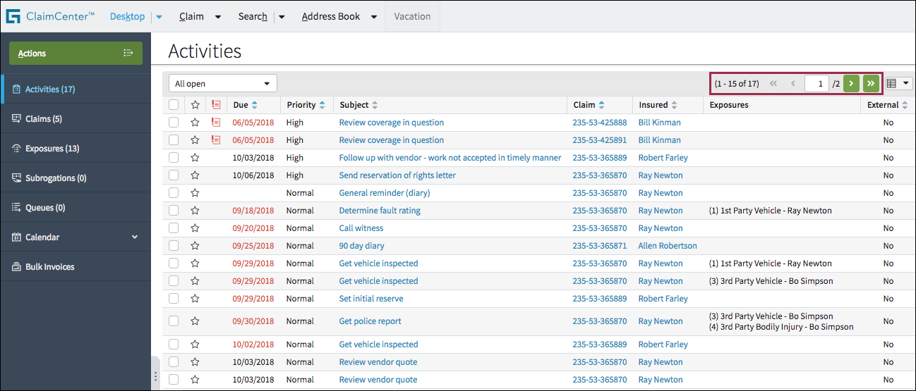
Table width
Tables contain data from a variety of sources and in many formats. Assigning the proper attributes presents a polished table with an appropriate width for a specific context.
By default, tables size to their content so tables with more columns or wider columns will be wider than other tables. Limit the number of columns to a reasonable number to prevent horizontal scrolling.
In some cases (for example when using pagination), it may make sense to stretch the table to fill its container.
- Stretch (default
false): This attribute instructs the table to use as much horizontal space as its parent container allows. The container could be an input column, various types of panels, or the screen widget. Stretch makes a narrow table wider, but its contents may force the table to be even wider than the container. Setstretch=truewhen a table should take up the whole width of the page. - Grow (default
false): For the table to span the entire screen, at least one column must be set togrow=true. If more than one column is set togrow=true, the columns share the extra space equally. See the section immediately below for guidelines about when and when not to setgrow=truebased on the data in the column.
Column Width Relative to Data
Use the attributes that most closely match the content type listed below.
- Defined-width Numbers (Phone, Serial, VIN, Account, Policy, Claim, Dates)
-
- More detail: Any number or data where there is a defined number of characters. Phone numbers in the United States have the format 415-123-4567 but can appear in other regions as +54 9 2982 123456. It is good practice to define standardized columns for these numbers.
- Recommendation: Set these columns to
wrap=false,
                                        grow=false
, and with a setwidth=XXem, where XX is the number of characters representing an upper limit for the data type.
- Predictable-width Numbers and Text (Financial Amounts, Names, Titles, and Attributes)
-
- More detail: Numbers or text with typical lengths, but where exceptions frequently occur. For example, names in North America are approximately 12 or 13 characters long. It would suffice to have a column containing names to be around 12 characters long but allow it to become larger when necessary.
- Recommendation: Set these columns to
wrap=false,grow=false, and with aminwidth=XXem, whereXXis the typical number of characters that the data type would most often require. Definingminwidthallows longer names to expand the column. Names that are shorter thanXXemwill have white space to their right, but it would not be excessive spacing.
- Descriptive Text Blocks (Descriptions, Explanations, Notes)
-
Generally, it is not advisable to include these long fields in a table column because they can take up a lot of vertical and horizontal space. They are also hard to read in a confined area. It is better to place descriptive text blocks in a multiline text box in a detail page. If it is necessary to include these descriptive text blocks in a table, however, follow these guidelines:
- More detail: The lengths of written text entries are not only difficult to predict, they are also commonly long enough to require a width greater than one screen resolution width. In these cases, it is preferable to allow the text entries to occupy more than one line. In addition, because it is far more acceptable to see greater white space where the user may already be accustomed to seeing long-form written data, this is the most acceptable column in which to allow a stretched list view to grow.
- Recommendation: Leave
wrap=true,no width definition, andgrow=true(when the table is set tostretch=true). Another recommendation is to locate these text columns at the right-most side of a table when possible. This placement reduces the need for a user’s eye to travel over a potentially large white space to arrive at the next piece of data. It is less jarring to have large white spaces when users know that there is nothing else farther to the right.
Column Headings
- Follow best practices for section labels.
- Use clear, descriptive column headings.
- In certain cases, clarity requires a column heading with several words
making the columns quite wide. Wrapping column headings is one way to make
columns narrower. When wrapping is necessary:
- Use non-breaking spaces to control line breaks. For example, in the following screen shot, a non-breaking space occurs after Group / in order to place Queue on the second line.
- Do not allow column headings to wrap to three or more lines.
Column Order and Alignment
- Column Order: In general, place status-type icons in the left-most column
followed by the information that uniquely identifies the object, usually
Name. This positioning is especially important if the identifying
column includes a link to details for that object. Users expect links and
important information to appear in the left portion of the table.
- Place wider columns farther to the right so that at least part of the column
is still visible even at a lower screen resolution.
- Center-align columns containing only an icon.
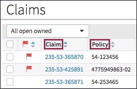
- Left-align standard text such as claim numbers, policy numbers, and the insured.
- Right-align currency when a column includes only currency.
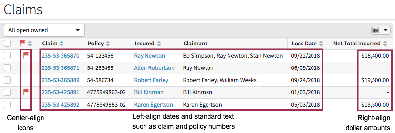
- When currency appears in a column with other data types, left-align all data.
- See best practices for currency alignment for details.
Filtering, Sorting, and Visual Cues
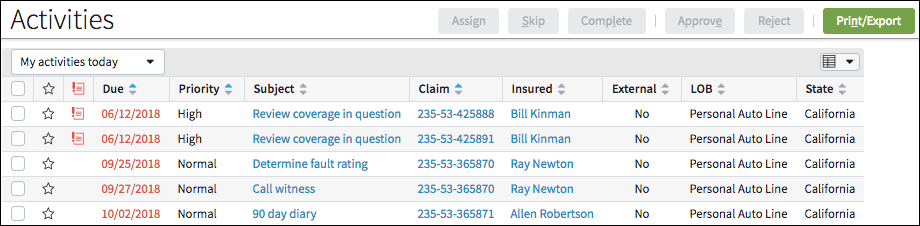
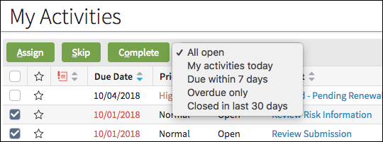
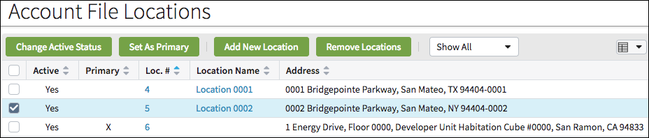
- Place the filter component close to where users are likely to be looking. In
the following screen shot, the filter is near key controls such as
buttons.
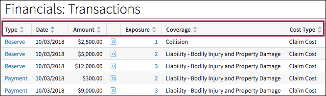
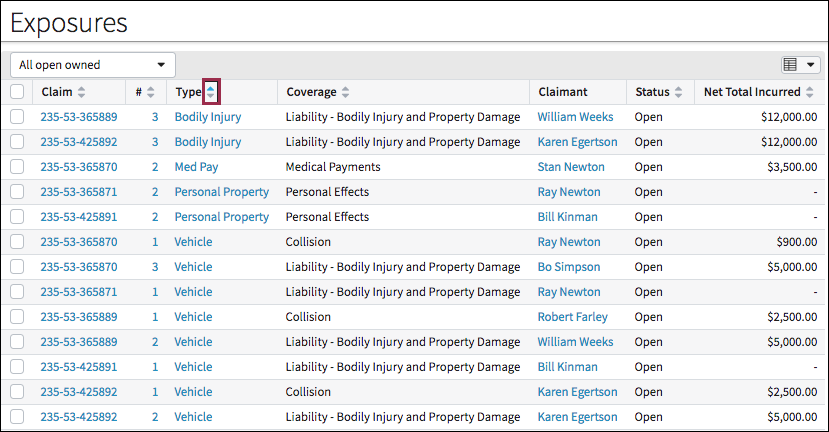
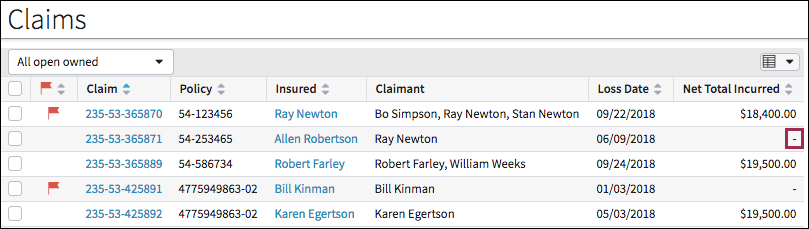
- The initial primary sort for a table is important. Ensure that this initial sort corresponds to the information needed for the most common tasks users will need to perform with the table.
- Sort the most important data by default and display a sorted state in the
column header. In the following screen shot, the sort order is by
Type.
Buttons in Tables
- Follow best practices for button grouping and sequence.
- Follow best practices for adding and deleting items.
- Any button directly related to data in the table should appear within
the table.
Currency
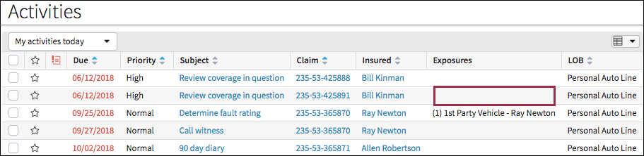
Cells without Data
Links in Table Cells
See best practices for links.
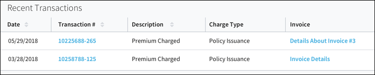
- Links in Cells with No Value
In certain cases, a cell has no value but might still require a link to the underlying object. In such cases, use a text-based link. The link text should reflect both the column header and the cell value. For example:
- The column header should be Invoice because this term applies to invoices with and without specified invoice numbers. Allowing for invoices with and without numbers helps users because a column might include an invoice reference number that serves as a link to details even if an invoice numbers is not a formal requirement.
-
If there is an invoice number such as 1122334455, the text link should read: 1122334455.
- If there is no invoice number, the text link should read:
Invoice details.
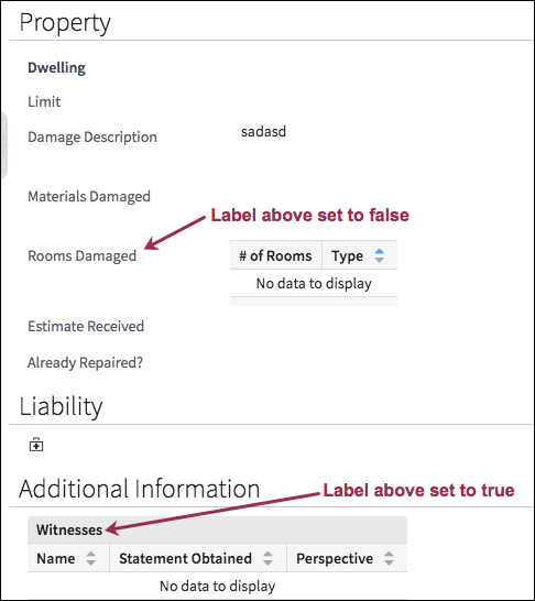
Label Above for List View Inputs
The label above property applies to all inputs including list view inputs.
Whenever possible, set labelAbove to true
to keep the entire table flush left and allow more horizontal space for the
table.