Charts
Usage
Charts display data as a graphic.
Use charts to distill and illustrate the most important data points from a large data set. For example:
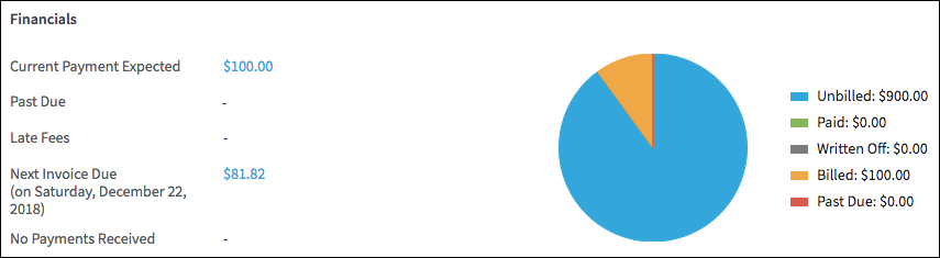
- Use pie charts to illustrate amounts, as in this BillingCenter chart.
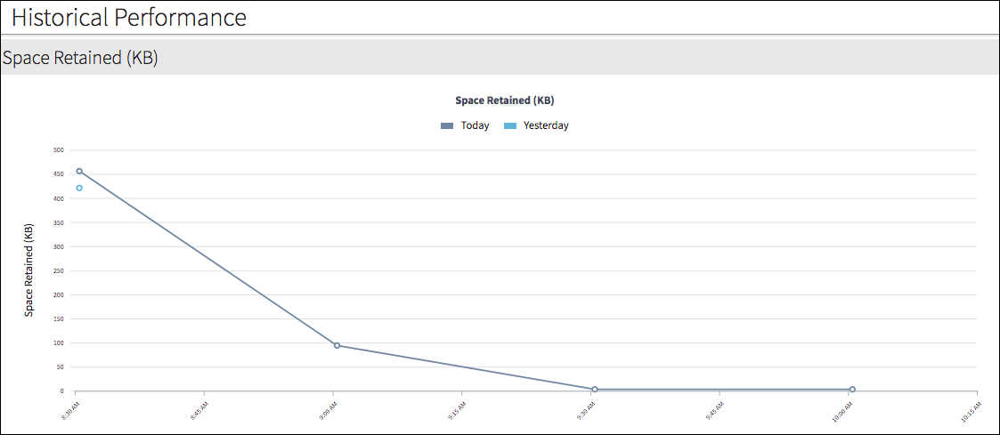
- Use axis charts to show activity over a period of time as in this historical
performance chart.
PCF elements
Primary function
- Panels
-
- Chart Panel
- Dashboards
-
- Chart Tile
- Tile Chart Panel
Secondary function
No elements use this widget as a secondary function.
Best Practices
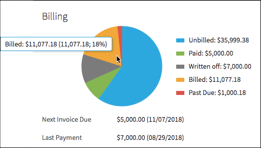
- Use colors to clearly distinguish chart dimensions. Avoid ambiguity by using colors that are visually distinct as shown in the chart below.
- Use a legend with labels to supplement color:
- Legends can be placed above, below, or to the right or left of the chart. Use the best placement for the specific context. In general, placing the legend below or to the right supports left-to-right and top-to-bottom eye scanning patterns for readers of western languages.
- For languages read from top-to-bottom and then right-to-left, place the legend in a position that best supports those reading patterns.
- Keep labels short wherever possible because the equivalent labels in languages such as French, Spanish, and German take up more space.
- Use tooltips to reinforce the legend.
- Use Spectrum (a Chrome plug-in) or a similar tool to see how the chart looks to users with various forms of color blindness.
- When possible, use high-contrast colors that will render well in black and white.
- If users are likely to print a page in black and white, test the design in grayscale.
- In cases where many data segments make the chart difficult to discern, enable the legend toggle feature. Users can then click an item in the legend to momentarily hide it.