Radio buttons
Usage
Radio Buttons
Radio buttons appear as a short list of mutually exclusive options and are easier and quicker to use than drop-down lists. Use radio buttons when:
- There are a small number of choices.
- The text strings are brief.
- The use case requires users to select one, and only one, option in the
list.
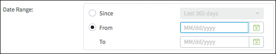
Choice Widgets
Choice widgets use Radio buttons to select inputs or sets of inputs. In the following screen shot, the From To choice widget is currently selected, making that set of inputs available and disabling the Since input.
PCF elements
Primary function
- Boolean Radio
- Radio Button
- Boolean Radio Button
- Range Radio Button
- TypeKey Radio Button
Secondary function
Choice
Best Practices
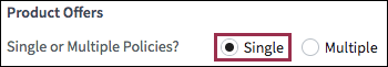
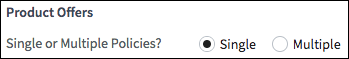
Field Labels
- Use short, clearly-worded field labels.
- If the field label is a sentence, use sentence case (only capitalize the
first word). Use a period or question mark for labels that are complete
sentences.

- If the field label is not a sentence, use title case (capitalize the first
letter in each significant word).

- Consider including a section label or verbatim
widget to introduce the radio button group.
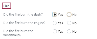
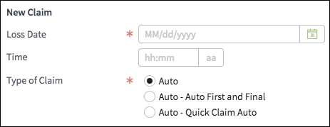
- Vertically stack radio buttons to accommodate longer labels as shown in the
following screen shot.
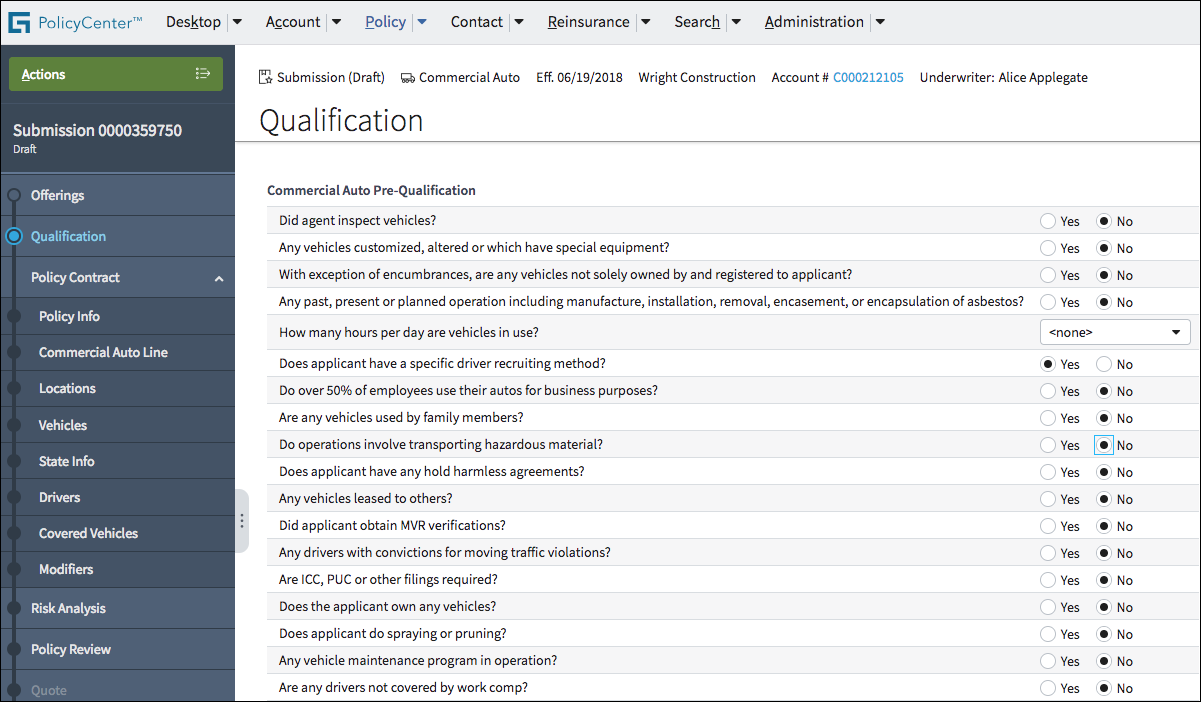
- Certain screens include a long list of questions and corresponding radio buttons. The field labels and radios are placed in a table (list view) within a detail view.
- Set the column with field labels (the questions in the following screen
shot) to grow. See stretch and grow guidelines for
more information.
Interaction and Default Options
Default options expedite data entry. When usage metrics are available, set the default to the option that the majority of users are likely to choose.