Dependent controls
Usage
Dependent controls refer to widgets that are initially hidden and appear only when triggered by a specific user selection. Hiding part of the UI carries risk. When deciding whether to use dependent controls the key factor is whether users are likely to realize that certain widgets are available but not currently visible. The UI must also convey how to display these widgets.
When to Use Dependent Controls
Use dependent controls:
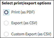
- When it's clear that changing the selection (as shown in the following screen shot)) will display functions and returning to the previous selection will hide those functions.
- To conserve space.
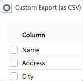
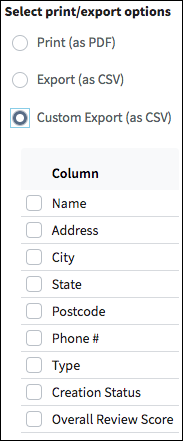
- To reduce the user's cognitive load by only displaying the information they need in a specific context. In the following screen shot, there is no need to display the CSV fields unless a user selects the Custom Export (as CSV) radio button.
 |
 |
When to Avoid Dependent Controls
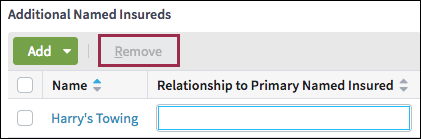
Do not use dependent controls in situations where a widget's absence might not be obvious. For example, certain grids include buttons whose applicability is based on the property of an object represented in a row. In these cases, display the button in a disabled state as shown in the following screen shot. See Disabled controls and Tooltips for details.
PCF elements
Dependent controls represent a pattern. There is no primary PCF element. Many widgets can be triggers for the dependent controls.
Best Practices
Follow the best practices for detail views,input columns, section labels, buttons, check boxes, drop-down lists, radio buttons, and text boxes.
- When showing users the initial set of options, keep the number of choices
manageable to avoid overwhelming users.

- Clearly associate the trigger with the additional input by placing the dependent
controls immediately below or to the right of the trigger. In the example below,
the additional input appears immediately below the Custom Export (as
CSV) trigger.