Navigating Product Designer
Every Product Designer page has a common set of navigation elements. Some pages have additional controls that are described elsewhere.
Key |
Description |
|---|---|
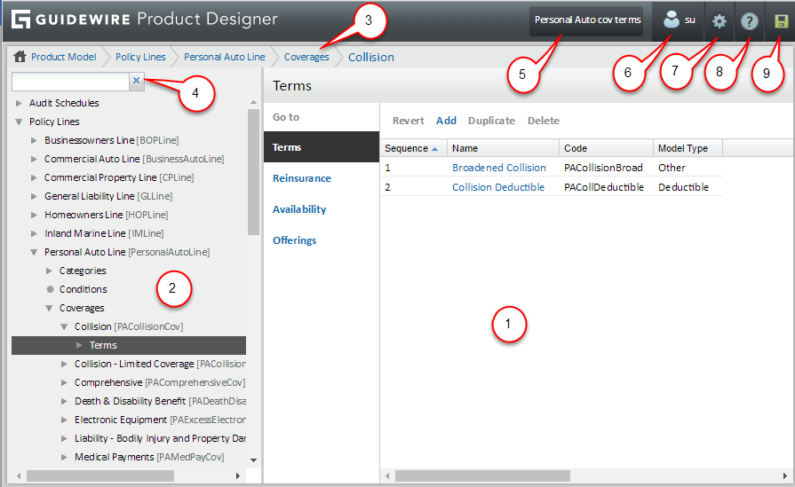
1 |
Typical Product Designer page, in this case, the Terms page. |
2 |
Navigation panel showing expanded section of navigation tree with the Terms branch selected. Use the up and down arrow keys on the keyboard to scroll through the nodes in the Product Model. The corresponding page appears as you press the up and down arrow keys.
Product Designer remembers the collapsed or expanded state for each subsection on a page. For example, if you expand the Advanced subsection on a policy lines page, then that subsection appears expanded on any other page on which it appears. These settings are stored per user, and are retained even if you log out of Product Designer. |
3 |
Breadcrumbs showing hierarchy of objects leading to the current page. Click the rightmost breadcrumbs link to view the parent page. Click any breadcrumbs link to jump directly to the indicated page. |
4 |
Filter box. Type the first characters of a node name. As you type, the filter hides every node in
the tree except the nodes whose names or codes begin with the
characters you typed. The code is the portion at the end of the
label enclosed in square brackets. Note that the filtered tree
also shows the parent nodes of each matching item, to help
identify its location in the product model. Click the adjacent
X to
clear the filter and restore all nodes to the tree. Note: If you
filter the tree and then add or duplicate a Product Model
item, the filter text is removed and the new item is
highlighted in the product model. |
5 |
Active change list
and change list menu. Displays the name of the active change list. An
adjacent down arrow |
6 |
User Tools. Click to display the User menu, described in Product Designer User menu. |
7 |
Options. Click to display the Options menu, described in Product Designer Options menu. Contents depend on whether the user is an administrator. |
8 |
Help. Click to open the help panel, which contains information about the current page. |
9 |
Changes. Indicates whether changes have been made to any objects and whether those changes have validation errors by changing as follows:
|
10 |
Go to links. For convenience, click to navigate directly to the associated page. Some of the links under Go to are also available in the navigation tree. |
 – Node with hidden descendants.
Press the right arrow key on the keyboard to expand the node and
reveal its descendants. Press the right arrow key again to
reveal the page of the first descendant node.
– Node with hidden descendants.
Press the right arrow key on the keyboard to expand the node and
reveal its descendants. Press the right arrow key again to
reveal the page of the first descendant node. – Expanded node. Press the up or
down arrow key on the keyboard to scroll through the list of
descendants. The corresponding page appears as you scroll
through the list. Press the left arrow on the keyboard to
collapse the node and hide its descendants.
– Expanded node. Press the up or
down arrow key on the keyboard to scroll through the list of
descendants. The corresponding page appears as you scroll
through the list. Press the left arrow on the keyboard to
collapse the node and hide its descendants. – Node with no descendants. Press
the left arrow key on the keyboard to move up to the closest
expanded node.
– Node with no descendants. Press
the left arrow key on the keyboard to move up to the closest
expanded node. – You have not made any changes.
 – You have made changes. Click the icon to open the
 – You have made changes but there are validation
errors. Click the icon to open the
– You have made changes but there are validation
errors. Click the icon to open the